Which MTA stations are optimal for street teams?
In a fictionary scenario, a non-profit organization WomenTechWomenYes (WTWY) solicited our engagement to use MTA subway data to help them optimize the placement of their street teams, such that they can gather the most signatures, ideally from those who will attend the gala and contribute to our cause.
In this regard, our group assumed that the higher traffic of pedestrians would mean more signinature, but this analysis would be more precise if leveraged by the proportion of individuals more interested in the cause of WTWY. We assumed, therefore, that female with high income or that work for tech companies would be more prone to attend to the gala. For this purpose, we collected demographics data from the Census and identified the areas in NY with more concentration of Tech companies.
Assumptions
- Station traffic
- Women population
- Income level
- Close to Tech Companies
The Data
Besides the NYC MTA data - which was a good source for extracting the volume of foot passers nearby the subway stations -, we collected the NYC Census Data for demographics by Census Block.
Data Exploratory Analysis
Data Cleaning
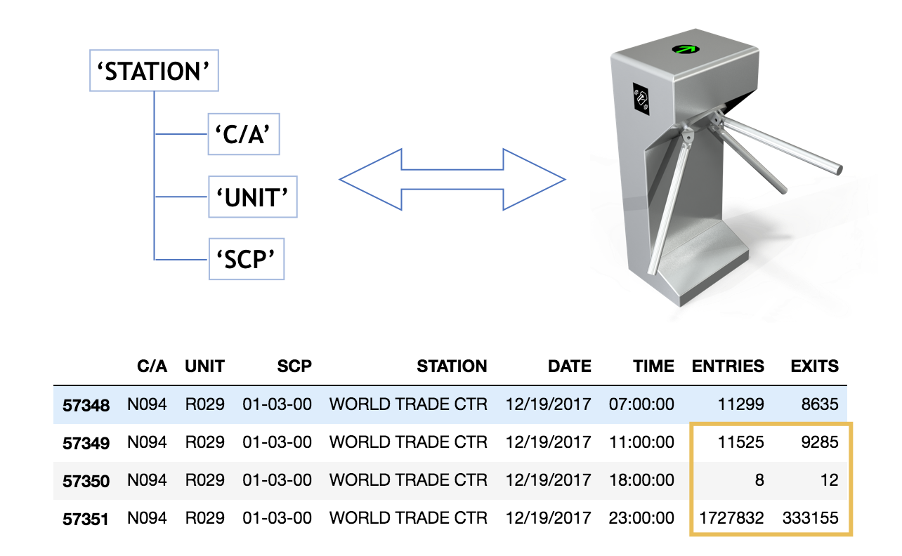
First, we created a pandas data frame with MTA Subway turnstile data, that gives you counts of entries and exits for each and every turnstile in NYC. It’s worthy mentioning, that the turnstile data was a combination of “C/A”, “UNIT”, “SCP” and “Station”.
With that information on hands, we started cleaning the data:
- Since the turnstiles register cumulatively, we calculated the actual entries and exits per day
- Identified and removed outliers
- Grouped the data by station
- Calculated average traffic per station, assuming that the volume of passengers is the sum of entries and exits
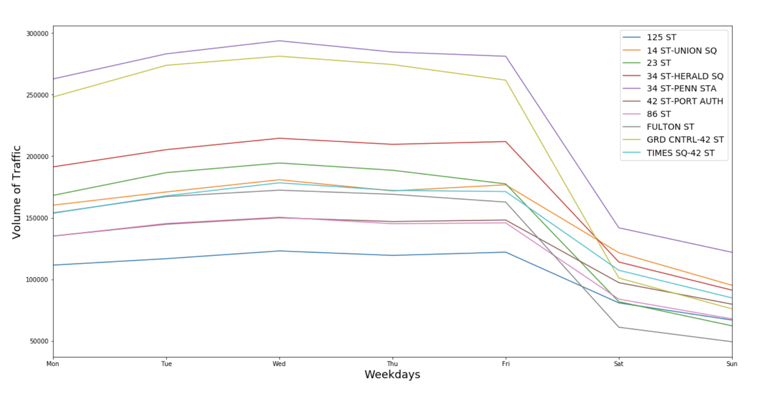
At this point, we could get the busiest stations. When brainstorming the project, our group discussed about being careful with selecting stations with higher touritic demand, because there was a higher chance to locals be in town to attend the gala. To avoid the street teams approach mainly tourists, we analized the traffic during business days and weekends, and noticed that the top stations have high volume of passengers in both periods and have a drop during weekends. This indicates that these places are frequented by residents.
The next step was to merge the MTA subway data with the Census data. Some groups analized these two groups of data separately, but we decided to use all the resources we had to create one unique data frame. The time was limited but with unlimited effort we could deliver it before the deadline.
Shortly the 3 steps for matching both datas:
1. Bring coordinates to the MTA Subway data: Merge MTA Subway with New York Open Data for adding geocodes for each station
For this step, we found out that the names were slighly different, for example, “50th St” vs. “50 St”. For working this around, the instructions mentioned the funzzywunzy Python package, highlighting that they had never worked with this before. It’s a tool for matching strings based on distance between two words, it means, on their similarity. With some precision, we could conclude this task.
2. Bring Census Tract to the MTA Subway data
The Census Block Conversions API can be found on the Federal Communications Commission (FCC) webpage and retrives Census variables based on coordinates.
3. Merge MTA Subway with Census Data
The last step was to merge all the data by Census Tract. And there we have a dataframe with all the information we need :)
Ranking the Stations
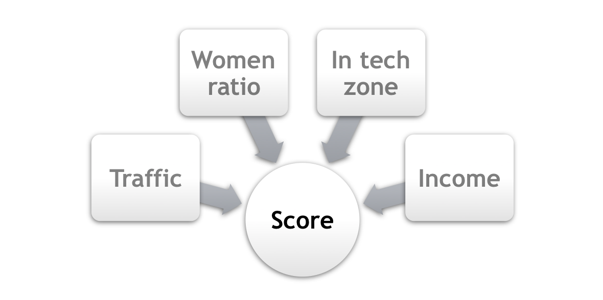
The method we chose to rank the stations based on multiple variables was to build an composite weighted score, following the steps bellow:
- Define the weights acording to the priority
| Variable | Weight |
|---|---|
| Traffic | 3 |
| Women ratio | 2 |
| Income | 2 |
| In tech zone | 1 |
- Normalize the variables
- Score = Weighted sum of all normalized variables per station
- Rank Scores
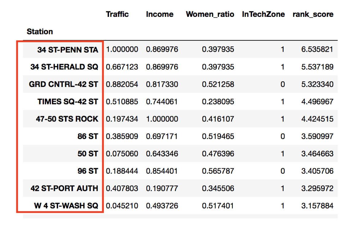
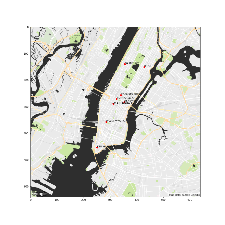
Finaly, based on the resulted rank, we suggested to our customer to focus the efforts on the top 10 stations.
Final Thoughts
Project 1 was a great opportunity for us to learn Pandas and exploratory analysis. We also learning the challenges of data cleaning.
The data cleaning wasn’t simple. Besides being messy and difficult to interpret, the databases had different location dimensions. While MTA provided information that could be aggregated by subway station name, Census listed the demographics by Census Block. For ensuring that we’d make a reliable analysis, we made a minuscious work of removing outliers and merging the different databases. Indeed, we spent 70% of our time on this task.
The other 30% of the time was for the regional ranking analysis. Since there were 4 variables, we decided to apply a composite score method, in other other words, to combine different variables in one. Finally, the scores - which were built also considering different weights for each attribute based on its order of imporcance - were ranked and provided the list of top stations for maximizing the fundraising to our client.